For this project I chose to create a cover for a travel book that gives information about Europe. I chose to do a travel book because when I was planning my time in Europe books about the areas I was going were extremely helpful in finding small excursions to do and places to go, and so I decided it would fit well with my overall topic of European travel. I mostly let the photos that I had from my time in Europe influence the design. I took time to look through all of the ones I had and see which would work best together and look the most visually appealing while still being cohesive as a whole.
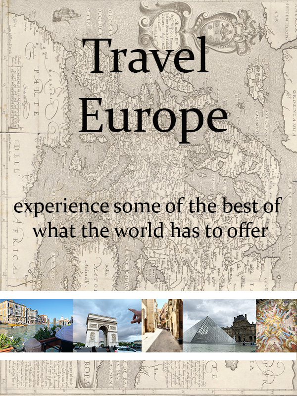
In terms of design principles that influenced me I chose to stick with leading lines as the key guiding principle in the work. I worked leading lines into the work by flipping the orientation of the map background so that the borders of each nation and the overall border of the map would lead the eye down into my selected photographs along the bottom of the “cover”. I also chose to work with the rule of thirds in my design as well. I did this by ensuring that the line of photos went across the middle of the bottom third of the work, while the text elements were split between the top and middle third. This use of the rule of thirds ensured that there would be no overload in any one area of the work.
For the actual visual elements for this project I used my own pictures for the line across the bottom of European sights and then I went into the creative commons to find a more stylized version of a map of Europe that I could use. It was very important to me that for the actual photos of Europe I used my own material and my own photographs.
The map of Europe was obtained through the creative commons and was originally published by Ars Electronica and is licensed under CC BY-NC-ND 2.0

I really like your blog; I am planning to Study Abroad next semester so your idea of using travel books has inspired me to order a few! I like the image you created and like that you incorporated the map in the background, but I think it might be useful to increase the size of your images, so they stand out a bit more and are more noticeable to viewers! Other than that, I really enjoyed your post.
LikeLike
Initially viewing your graphic design for your book cover, I really liked the layout of the images and the strip near the bottom of the page. All of the images integrated into the design have a strong correlation to one another and convey your purpose and theme very well. One critique I have is to reorientate the background image of the map since it is sideways from the viewers point of view. This would be an easy adjustment and would just enhance the flow of the design even more. Another critique I have would be to possibly add some texture, vignette or just some simple editing to the background image just so it doesn’t look so flat. This will just help tie into the piece because small details always matter! But nice work this draft is really well put together.
LikeLike
I love this idea! It’s a beautiful creation that you have created and has so much wonderful potential. I think the strongest point of this piece is the photo strip on the bottom of the cover. I recognize some of the places on the bottom which helps tie into the theme of Europe. I agree with some of the other feedback that has been said, in terms of a little editing on the background and adding a fade could be really nice on the map. Additionally, the words could use some editing and shadowing (like in the last photoshop tutorial) in order to help the piece, look more cohesive and really bring it all together. All in all, this is a great idea and it was awesome to read your idea first and then see it come to fruition in this draft.
LikeLike