Logo Draft Project

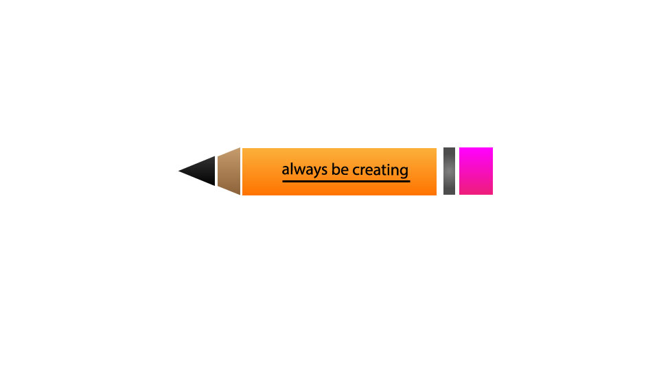
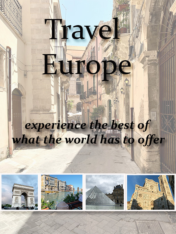
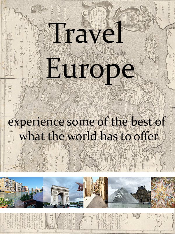
For my draft my number one concern was to make something simple that fits well into my blog topic. From that main point I decided to go with the idea of a minimalistic luggage set that has the name of my blog across the two suitcases in the front. This is very clearly related to the topic of my blog because I have chosen to write about traveling throughout Europe and so the luggage set is fitting. I also included the added touch of “stickers” on the suitcases with various names of notable destinations throughout Europe, as an added dimension of interest.

I didn’t really do any research in figuring out my design. I suppose a lot of the inspiration for it came from many modern logos sticking to a more minimalist idea and trying to keep the design clean and simple. It is the idea of keeping a logo simple and thus easy for the audience to process and recall to memory when seen again. In corporate logo design it is key that the audience does not have to think too hard to associate the logo with the company and their mission and goals.

To create this project, I used fairly simple illustrator techniques. Because of what I chose to do for my logo it was essentially using a collection of separate rounded rectangles and arranging them some in front and some in back to create a feeling of depth in the layout of the image. Within each shape I added a gradient to the background as well. I struggled at the beginning in figuring out how to make the logo not seem as flat and so I chose to attempt a gradient within the base shape of the suitcases, and I am quite happy with how it came out. I was lucky outside of this minor setback and avoided any issues with the actual adobe software while completing the logo design.

Graphic Design Final

For my graphic design project, I decided to design a travel and tourism book cover. I chose this because this summer I was lucky enough to travel in Europe and learn a lot about the cultures there and about myself. In the original stages of planning the trip, my dad gave me a tourism book for Sicily and it really helped me in figuring out the places that would be most interesting and thought provoking for me to see. I ended up bringing the book with me on my trip as well and it allowed me to keep changing my plans in the moment and opened me up to more adventure through the information it held. It is for that reason that I chose to design a tourism book cover for the graphic design element to open my blog to the stories that come with traveling in Europe.

In terms of putting the design together the main design principle that I let guide me was the rule of thirds. In my final draft the two text elements and the strip of photos towards the bottom are all separated and spaced out into a separate third of the frame. I chose to mainly let this principle guide me because I did not want the design to seem top or bottom heavy, but I also did not want the entirety of the design to be right in the middle. I wanted to create a feeling of balance and equal spacing on the cover, and I believe that I have accomplished that.

The process of collecting elements was quite smooth for me, especially for my final draft. I chose to only use photos that I took while on my trip in Europe. This is something that I did decide to change after my draft of the project. I decided to replace the map that I had found on creative commons with a photo that I personally took in Oritigia. I did this to ensure that the photo would still be included while also ensuring that the photos across the bottom that I want to include were able to be larger. The sizing of the photos is the number one critique that I saw and that I got feedback on, and this is how I chose to solve that issue. I just took one of the photos out of the line across the bottom and made it the background and then resized the ones that were left.

I decided to use the information from the Layers Introduction photoshop tutorial to add in a proper border around each of the photos along the bottom as well. I added in the shadowing on each picture and the text on the top of the cover. I feel that these changes helped with the critique that I got about making it seem less flat, and more visually interesting.  

Graphic Design Draft

For this project I chose to create a cover for a travel book that gives information about Europe. I chose to do a travel book because when I was planning my time in Europe books about the areas I was going were extremely helpful in finding small excursions to do and places to go, and so I decided it would fit well with my overall topic of European travel. I mostly let the photos that I had from my time in Europe influence the design. I took time to look through all of the ones I had and see which would work best together and look the most visually appealing while still being cohesive as a whole.

In terms of design principles that influenced me I chose to stick with leading lines as the key guiding principle in the work. I worked leading lines into the work by flipping the orientation of the map background so that the borders of each nation and the overall border of the map would lead the eye down into my selected photographs along the bottom of the “cover”. I also chose to work with the rule of thirds in my design as well. I did this by ensuring that the line of photos went across the middle of the bottom third of the work, while the text elements were split between the top and middle third. This use of the rule of thirds ensured that there would be no overload in any one area of the work.

For the actual visual elements for this project I used my own pictures for the line across the bottom of European sights and then I went into the creative commons to find a more stylized version of a map of Europe that I could use. It was very important to me that for the actual photos of Europe I used my own material and my own photographs.

The map of Europe was obtained through the creative commons and was originally published by Ars Electronica and is licensed under CC BY-NC-ND 2.0

Image Collection

All of the following images were taken by me personally during my time in Europe.

for this project I have not yet decided which would be a better fit for my topic. I have thought about doing a travel ad in a magazine but then came up with the idea of doing a “European Icons” tourism book cover with some of these images.

the arc du triomphe in Paris
the Duomo in Florence
the Eiffel Tower in Paris
me on a hike along a crater ridge on Mount Etna, Sicily
the Grand Canal in Venice
The Notre Dame de Reims in Reims
a street in Oritigia
the Louvre in Paris
Painted Ceiling of the Galeria degli Uffizi in Florence

Let us Embark upon A European Adventure

For my Com 210 topic I have chosen travel throughout Europe, with a focus on Italy. I chose this topic because this summer I was lucky enough to travel through and live in Europe for about two months and I fell in love with Italy in particular. It is the newfound love of European and Italian culture that makes me passionate about this topic to want to share it with everyone through the blog I will be curating for this class. I want to use this topic and the projects around it to get other people excited about the idea of visiting such awe inspiring nations.

a view looking over rooftops of Catania and out to the Mediterranean

I plan on collecting original materials through the hundreds of photos and videos I took in my time abroad this summer. I have around 450 original photos and videos stored on my phone taken throughout the two months I was in Italy. I also have videos that show lesser known areas in France as well as photos that capture less tourist filled regions of Italy. I plan to conduct my own interview as well to get original material for the Unit three project.

I already have a plan for at least two of the unit projects as well. For the photoshop unit I pan to take some of my original photos from Europe this summer and put them together to resemble the cover of a travel brochure. It will advocate for the finding of a new cultural experience through European travel.

For the audio editing unit, unit three, I plan to conduct an interview with my father. He is someone who has been very lucky in the amount of travel he has done, through Italy especially. He has been to more areas of Italy than I have in is vastly familiar with some of the less glamorous aspects of international travel. My father also has a very deep appreciation for other cultures and so he provides a very genuine and enjoyable narrative of some of his Italian adventures.

The entrance to the storied Louvre Museum in Paris, with a wing of the museum present in the background.

For my inspiration file thus far, I have collected links to the two most famous European art galleries in the world; the Uffizi in Florence and the Louvre in Paris. I am also including a link to a website focused on helping to plan and book vacations in the Tuscany region of Italy, a place like no other. The Uffizi holds a special place in my heart and in my life after this summer. It is truly a museum and an experience unlike any other and so it is included as the first link in my inspiration file due to the vast personal impact it had upon me.

https://www.florence-museum.com/uffizi-gallery-tickets.php

https://www.louvre.fr/en/

https://www.discovertuscany.com/